
Symbiosis of Script, Font, and Form | 2022
Southern Methodist University
Bridwell LIbrary Special Collections
January – March 2022
Jon Speck and Rebecca Howdeshell, co-curators
Tropos
Tropos is a book of turns, changes, and response, from the painterly manner of its production to the ways it is experienced in the hands, by the eyes, lips, and ears, and along the memory of the drama it projects. With pages folded at the fore edge and the spine supported and enclosed in a slotted dowel, the book stands on its own in resistance to closing and recumbency. Top and bottom edges were cut on the bias so the text block appears canted, a parallelogram when pressed closed, and a rhombus when held open. In this copy the dowel has been stained black, although in most the dowel remains raw pine. A display edition features an extended dowel mounted onto a base so that the book might be shown as a flag on a mast, or perhaps read as from a soapbox in a public square. A die-cut penetration through the text block reveals a pair of cobalt glass cabochons affixed inside the front and rear covers. Hand-mixed ink in thirty-seven colors saturates the sheets and is printed in separate color layers, sometimes blended on the offset roller of the press, that deepen with each overlay.
Artist Kevin Osborn (b. 1951) began work on Tropos in 1984 while he was a teacher in French West Africa and then continued to develop it for the next four years. His journals, drawings, and photographs that became a source for Tropos record his awareness not so much of an obvious social duality, but of the dynamic space he has occupied within superimposed cultural matrices. The book, a dialogue verso to recto, and a narrative from front to back, is a graphic unfurling of that fabric. The text also, alternately constrained and released, in language uttered gently, or drowned out in turbulence, stated in accusation, violence, or reconciliation is set in ordered rings consistent from page to page, particular words calling out in turn when so compelled.
The scene opens with slashing marks on the cover and front pages like trailing sparks or storm blown straw. A heart-shaped face from which the slashes emanate is discovered and the first of words and phrases appear, short textual arcs on concentric rings with other bits revealed on subsequent pages. A blue-lined space, a blue stream, and then monochromatic green palm trees set a tropical stage beneath a comet with furling tail. An archipelago of sea, earth, and the heavens, materializes within the limits of the open pages as well as the words, “OBEY STALE COLA HUNGER GROUND” and “FALL FROM SKY GARDEN.” References to dualities in opposition are made, the fluorescent yellow Ouroboroi intertwined, each consuming the other. Deep within die-cut tunnels the glass cabochons offer their blue glint to serve as eyes of silhouetted faces obscuring the isles. “WHEN ONCE UPON” seems to be the utterance of the verso character, while “NOT IF EVER AFTER DUAL” is the reply from the recto.
The next page brings an overlay to the red recto face of palm fronds, the earth, and sargassum, with a text “FALL FROM SKY” over a purple glove, “GARDEN,” “BODY GLUESS,” “REACH,” “HEAL CHATTER,” and “HEAR” encircling him. The debate continues reaching a stormy pinnacle where the verbs “HURL HURL HURL” are the silver overprint, and several pages later handprints obliterate the pair and the scene. In the end, “HURL” is opposed by “HEAL,” which wins out when the recto character is convinced. With the approval of ten purple gloved hands the atoning text “IN GODS ALIVE EMBRACE GLOSSY CLOSE” can be read. “YES NOW,” “HEAR NEWS IN PARTICULAR CHATTER,” “EVER AFTER HEAL,” is the reassuring benediction.
After working for a manufacturer of spectrographs and diffraction gratings, Kevin Osborn entered the École Nationale Supérieure d’Art in Nice as a student and created his first livres d’artiste in the early 1970s. He investigated offset lithography as an artistic medium, and rather than separating colors as in commercial printing he learned to use multiple impressions of hand-mixed inks, blending them on the offset press as in Tropos. While recognizing that his “artistic work process originates from a manufacturing environment” in which components that have been fabricated using a variety of means are assembled in production, Kevin Osborn explains that his approach “uses chance occurrences in the process to layer, discover, and create the final work.” He is more aligned to the sensibilities of a painter than to those of a printmaker or printer.
Material Noise: Reading Theory as Artist’s Book | 2019
MIT Press, 2019
ISBN-10: 0262042924
ISBN-13: 978-0262042925
Anne M. Royston
Introduction: Between Theory and Artist’s Book
excerpt (Pgs. 13–14)
A Shape for Artistic Argument
. . .
But what does “creative” mean here? So far, we have treated the creative as material, emphasizing the need to read theory as an artist’s book. Discussing Kevin Osborn’s nearly illegible artist’s book Tropos. Renée Riese Hubert and Judd D. Hubert declare it a work of poststructuralist theory as well as an artifact: “It attains by technique, and not at all by discourse, undecidability.” This distinction marks (or… perhaps reinscribes) a difference between discourse and technique that doesn’t apply to artistic arguments. Rather, discourse and technique, semantic argument and material, work in tandem with one another. The theory that surrounds and supports artistic arguments is as creative and innovative, even poetic, as the material that comprises them.
Journal of Artist’s Books | 2016
Journal of Artist’s Books #39, Spring 2016
ISSN 1085-1461
Lyn Ashby
“Coming to Our Senses with a Modern Mythic Form —
Post-Literacy in Artist’s Books”
excerpts with permission [Pgs, 6, 8–9]
In this paper, I want to consider the possibility that when we read artists’ books and their curious kind of literature, we are participating in a new kind of literacy, and that, in honor of the quietly evolutionary nature of this new literacy, we might call it ‘postliteracy.” …
A Modern Mythic Form
If our standard literacy represents itself with standard chronology, how would a new literacy represent time? What kind of story could it tell? How would it tell that story, if not with narrative time? I would argue that our usual story form, the narrative, is inherent in the linear sequentiality of our standard language structures. Language is infused with hierarchical, subordinate relations, which themselves imply stories, and these stories are generally projected in sequential, causal chains. In preliterate, oral language forms, however, meaning did not especially depend upon chronological time. Other forms could prevail.
Traditionally, we might associate the word “myth” with preliterate world views that, among other things, offer various explanations of cosmic creation or supernatural ancestry. Most cultures have such myths somewhere in their DNA. But I want to explore this term in a more contemporary sense here, focusing on the temporal madness of the mythic method.
Myth is a form that potentially permits a single, synchronous overlay of the various times and dimensions of different ideas, events, and experiences. It is relatively rare to find in the contemporary artists’ book the conventions of the standard narrative. Instead, in the spirit and method of myth, the artists book often offers a more open field capable of hosting multiple, simultaneous, perhaps contradictory, moments, spaces or realities— often in defiance of temporal logic.
As a form that confounds many of the conventions of standard literacy, including time, myth may well be a mode, I suggest, that is recreated anew in the artists’ book, which is perhaps a hardcopy home for a modern mythic form.
“We begin again,” McLuhan writes, “to structure the primordial feelings and emotions, from which 3000 years of literacy divorced us. We begin again to live a myth.” While McLuhan wasn’t referring to artists’ books here, he might well have been.
Myth is just one form, I suggest, in which the temporal dimension is explored with this possible new literacy. And myth often renders time in cycles.
One bookwork whose representations of time suggest to me the forging of another literacy is Real Lush (1981) by Kevin Osborn. This work too is often quoted for good reason. This work masquerades as a kind of fat little flip book. In it, time has become multiple cycles of time as the text and image elements are revisited at various intervals and layered into larger patterns of interaction. And this allows rhythms of meaning to accrete and resonate.
A large vocabulary of repeating visual elements include drawings of a landscape, the torso of a woman, machinery, photographic images of various faces, and so on. Many textual fragments add to this lexicon, such as “destiny,” “delay,” “violence,” “beauty,” “difficult to change,” and many others. All these elements are cycled and recycled. Over the various juxtapositions of such elements, portraits of some main characters incrementally arise. There is a father who “always had a plan,” a mother who “wanted to eat the petals of a flower,” a frightened and lonely child, and a narrator/author who might, at different times, be any of these characters. The varying conjunctions of elements encourage different interpretations of the same elements.
For example, the phrase “Up and Over” in conjunction with different sets of images variously implies something athletic, psychological, sexual, or military. Phrases such as “he liked to run his hand down the dull metal of the engine” connote different and compounding meanings when placed variously in conjunction with the image of a generator, a primeval bison, or the torso of a woman.
In a conventional storyline, these momentary combinations of elements might resemble “events,” but the result here is very different. These are more like shifting nodes of meaning that do not condense into causal chains or hierarchical structures, nor encourage conclusions. Amid the complexity of overlay, which is both visual and metaphorical, these elements and cycles simply speak as, and between, themselves each time. This allows their own mutually modifying moments of meaning to arise and pass.
This book proposes and presents a conception of time and a way of accreting meanings that is very different from the plot lines, events, and conclusions of conventional narrative sequence. Its grammars of accumulation, association, repetition, and resonance avoid linear disquisition, and, like it or not, speak more like the changing conditions and chaos of a real life lived.
Booktrek | 2013
JRP | Ringier
ISBN 978-3-03764-207-8
Les presses du réel
ISBN 978-2-84066-574-8
Clive Phillpot
Selected Essays on Artists’ Books (1972–2010)
Excerpt [pgs. 86–87]
Daumenkino | 2005
Snoeck Verlagsgesellschaft mbh
ISBN: 3-936859-26-4
“Expanded Daumenkino”
Excerpt [pgs. 214–215]
The Cutting Edge of Reading: Artists’ Books | 1999
Granary Books, 1999
ISBN: 1-887123-21-0
Renée Riese Hubert & Judd D. Hubert
“Introduction: The Protean Artist's Book”
excerpt
… modified flip-books—volumes bound in such a way that they refuse to stay open and, thus, provide the generic opposite of spiral books—can serve a similar purpose by creating a kinetic difference between bookwork and ordinary book production. Kevin Osborn has contrived the most complex example of this kind of work, Tropos, a deliberately misshapen work, bound in wood and plastic, and revealing through die-cut holes in the Japanese folds riotous colors and a deranged typography. This almost illegible masterpiece of book art seriously questions long ingrained reading habits. Not only does Tropos find its rightful place among postmodern artifacts, but within poststructural theory as well. For it attains by technique, and not at all by discourse, undecidability.
Esthétique du Livre d’Artiste | 1997
Bibliothèque Nationale de France, 1997
ISBN 2-7177-2014-6
Jean Michel Place, 1997
ISBN 2-85893-291-3
Anne Mœglin-Delcroix
“Une poètique du livre”
excerpts [Pgs. 304, 323]
L’artiste américain Kevin Osborn, dont les livres ne contiennent eux aussi que des images, affirme que ses sources sont pourtant prioritairement dans ses lectures et qu’il lit tout le temps car, dit-il, “il ya plus d’images dans l’écriture”, que ce soit celle des textes littéraires ou des ouvrages scientifiques.
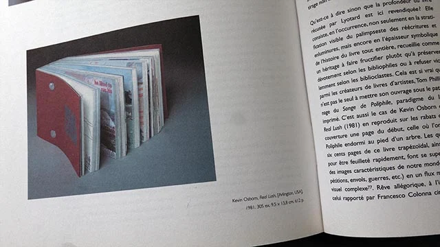
Qu’est-ce à dire sinon que la profondeur du livre récusée par Lyotard est ici revendiquée? Elle consiste, en l’occurrence, non seulement en la stratification visible du palimpseste des réécritures et enluminures, mais encore en l’epaisseur symbolique de l’histoire du livre tout entière, recueille comme un héritage à faire fructifier plutôt qu’à préserver dévotement selon les bibliophiles ou à refuser violemment selon les bibliocastes. Cela est si vrai que parmi les créateurs de livres d’artistes … mettre son ouvrage sous le patronage du Songe de Poliphilie, paradigme du livre imprimé. C’est … le cas de Kevin Osborn dont Real Lush (1981) en reproduit sur les rabats de sa couverture une page du début, celle où l’on voit Poliphile endormi au pied d’un arbre. Les quelque six cents pages de ce livre trapézoidal, ainsi relié pour être feuilleté rapidement, font se superposer des images caractéristiques de notre monde (compétitions, envols, guerres, etc.) en un flux mental et visuel complexe. Rêve allégorique, à l’instar de celui rapporté par Francesco Colonna cinq siècles plus tôt, voyage initiatique d’un jeune homme au cœur de la vie actuelle, il est imprimé en offset, technique contemporaine s’il en est. Toutefois, ce livre a requis l’utilisation de plusieurs plaques par page et un travail direct sur la presse, lequel de l’aveu même de l’artiste, entend égaler dans son ordre la qualité de la gravure dans les livres anciens. Un des rares fragments de texte intégrés aux images dit ceci: “Loin / le parfum des rêves / s’élevant des pages d’encre” (Far away / the odor of dreams / lifting off / from pages of ink.) À travers l’évocation de l’odeur persistante de l’encre dont sont faits les rêves dans les livres, est certes suggérée entre l’ouvrage ancien et le nouveau la persistance de la thématique onirique, mais aussi la continuité du travail de l’atelier où l’encre les imprime.
The Atlantic | 1990
The Atlantic, October 1990, Volume 266, No. 4
ISSN: 0276-9077
Pamela Petro
“Books as Works of Art”
excerpt [Pgs, 132–133]
…artist’s books make wonderful travel guides—not to individual places but to a particular way of seeing.
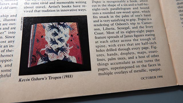
…Tropos is recognizably a book, albeit cut in the shape of a six-and-a-half-by-eight-inch parallelogram and bound in to a rounded raw-wood spine, which fits smack in the palm of one’s hand and is very satisfying to grip. Tropos is a rendering of Osborn’s trip to Cameroon, Liberia, Senegal, and the Ivory Coast. Most of its eighty-eight pages feature spreads of Janus figures staring at each other across the trough of spine, with eyes that are half-inch holes drilled through every page. Figures, hands, droplets, maps, coastlines, palm trees, and a host of other things accumulate as one turns the pages, superimposed on the faces in multiple overlays of metallic, opaque, and translucent inks in many colors. Words accumulate as well, sometimes in phrases, but often alone (like travelers): “Just Passing Through,” R U Local,” “R U Lonely,” “Hostile Vegetables,” “Heat,” “Salute,” and repeated frequently, “Hurl” and “Heal.”
"With Tropos, the physical structure of the book and the activity of "reading," of turning pages one, by one animates the content. A stack of pages under one’s left thumb implies accrued experience and the orderly perspective of elapsed time. Words and images abruptly appear, and reappear in different combinations on following pages; sometimes the Janus figures beneath them smile, sometimes they don’t—usually if one is happy the other isn’t.
What Osborn has concocted here isn't the story of what happened on his travels but an experience that mimics the journey itself, which while it’s in process is anything but coherent. One page represents the current horizon and all the traveler’s momentary ken; turn it, and the next might represent a movement in space—he’s climbed over the next hill, and the same landscape tilts a little in his perception. Or perhaps he hasn’t budged, but his mind’s eye has altered the look of his surroundings.
This, Osborn thinks is the beauty of an artist’s book. One structure holds multiple viewpoints, and transition, inherent in the very idea of travel, is necessarily implied in the book’s design. What the reader receives is a fleeting impression of West Africa, through colors, trees, and landscapes, and also a more precise one of the traveler’s states of mind: clarity, frustration, excitement, helplessness, boredom, wonder, nostalgia. It underscores the impression to know that Janus is the god of gates and doors, of beginnings and endings, but Tropos implicitly communicates this through the rhythm established by its pattern of words and images.
High Performance | 1989
HIgh Performance, Summer 1989
Judith Hoffberg
“Printed Matter: “Tropos by Kevin Osborn”
excerpt [P, 77]
According to the dictionary, “tropos” means continued turning in response to some specific stimulus. If so, then isn’t “tropos” the definition of a bookwork, the reader turning each page stimulated by the knowledge that the sequence of pictures and words and the movement of ideas make a whole? Kevin Osborn, an artist who has been making offset bookworks for many years, has produced an outstanding example of what contemporary artists’ books should be and can be if pushed to their extreme.
Osborn has always used an oblique format, and this time the 6-inch by 8-inch parallelogram lends itself well to the sequencing of the pages. The 88 pages are full of magnificent color, featuring 37 metallic, translucent and opaque inks in multiple overlays, many in split fountain. Typical of Osborn’s other bookworks, the lush color is diverted, in this instance, by a small hole drilled throughout. Two blue jewels, as eyes, are embedded in the inside covers of the book, always present when reading.
In fact, the reader really “reads” the book not only with his/her hand, which helps in sequencing, but also with the eye which reads the “soundbites” which are everywhere on the page, phrases, such as “just passing through,” “Black Sky, Wet Dies, Just Passing, Heal Dry, Never Come Back, Rose Valve, Ready Add Flesh.” These words are hurled across the page, oftentimes superimposed upon lush jungles, or strewn between mountainscapes, or emanating from the mouths of two individuals who face each other—head to head … with so many words pouring out of their mouths that it’s hard to hear.
In the midst of these soundbites come silvery words in layers of color, with layers of meaning. About two-thirds of the way through, we get a page saying “Heal” and on the opposite page, “Hurl.” These two words represent the theme, but also portray the very essence of human beings, capable of “hurling” insults, casting anger, overthrowing with violence, as well as healing, helping others, being compassionate, restoring and rehabilitating our fellow human beings. This is the essence of this bookwork, thrusting us into dichotomies. Life with its heavy foliage, its thick jungles, strives for simplicity, but instead the complexities distort, dissuade, disjoint. (The book’s rhythms remind one of drumbeats in the jungles of Africa, a country which the artist visited and which inspired this artwork.)
Osborn seemingly paints with ink, and the overlays of myriad colors make the complexity of the pages as much paintings as visual printed pages. We push through the density to find simple, sublime pages.
Artist's Books: A Critical Anthology | 1985
Peregrine Smith Books
ISBN 0-87905-207-4
Visual Studies Workshop Press
ISBN 089822-041-6
Clive Phillpot
“Some Contemporary Artists and Their Books”
excerpt [Pgs, 126–128]
Nevertheless it seems that Kevin Osborn has rarely been willing to uncritically accept this structure that is so familiar as to be unconsidered by most of its users. It is as if Osborn wishes to jolt his readers out of their easy acceptance of the book form so that they will be more alert to its inherent properties.
While Osborn’s handling of the imagery in Salamander (1976) is very assured, the form of the book is conventional. Whereas Repro Memento (1980) has an unusual form, which is, however, inseparable from its content. Since the pages of this book are trapezoidal, with the shortest sides in the gutter, the pages open into an exaggerated perspective, thus emphasizing the repeated motif of the book: a receding vista converging dead center. The book is bound accordion-style; the paper semi-transparent; and some pages have been printed on the back as well as on the front. Fragments of the total picture appear on different pages, so that one is obliged to look at the whole book in order to absorb the complete picture.
Parallel (1980) entails another unusual format. The sheets which make up the pages have not been folded conventionally, but from corner to corner, so that the book is a triangle which opens up into a diamond-shaped double spread. Parallel is a very quiet book. On creamy-colored paper the faintest pastel-colored inks have been laid down, so that the abstract imagery only becomes visible as the book is angled into and out of the light. The center pages appear to be completely blank at first sight, but actually bear one almost invisible word repeated across the page from corner to corner. The imagery, though muted, appears very busy at the beginning and the end of the book when contrasted with the virtually empty pages at the still center of the book.
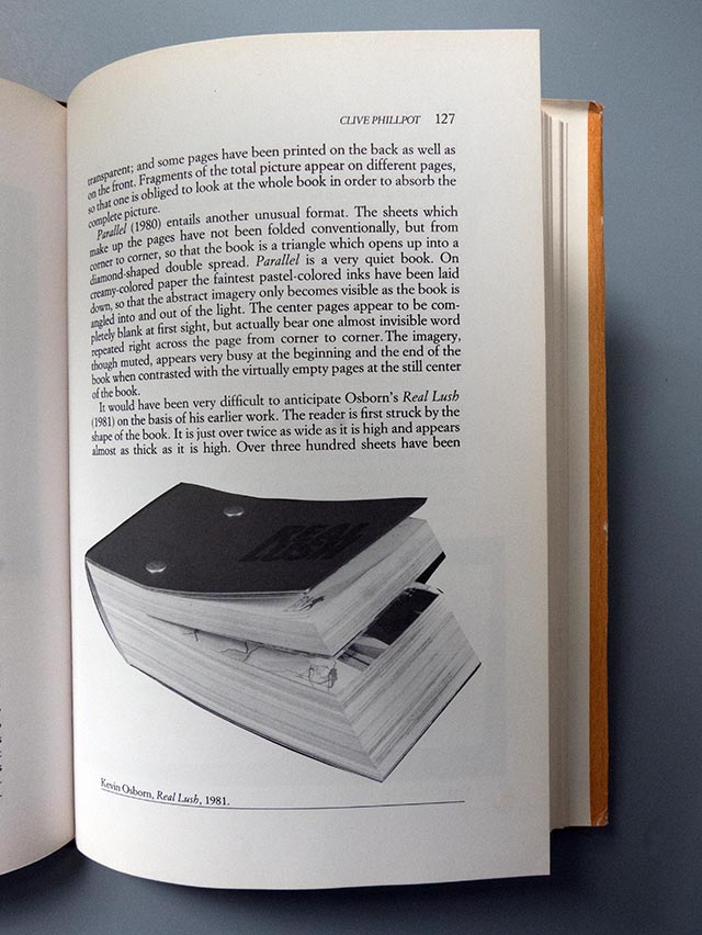
It would have been very difficult to anticipate Osborn’s Real Lush (1981) on the basis of his earlier work. The reader is first struck by the shape of the book. It is just over twice as wide as it is high and appears almost as thick as it is high. Over three-hundred sheets have bolted together so as to give the book a rhombic cross-section. This configuration facilitates the flipping of the pages, determines the principal direction for reading, and signals a different reading experience.
While Real Lush can be seen to have features in common with Osborn’s earlier publications, the ambition, density, and complexity of this book represent a remarkable imaginative leap. Through many pages and many printings Osborn creates a variety of modular sequences linked together to provide the reader with a roller-coaster ride through different visual experiences and states of mind. As many as a dozen layers of ink and images may coexist on a single page. When this happens the result is generally visual cacophony, but other sections are as spacious and as tranquil as his earlier books, and act as keys with which to unlock the denser pages. The excavation of images and moods is accomplished through the reading of many pages, rather than by the intense scrutiny of a single page as if it were a painting.
Betsy Davids and Jim Petrillo
“The Artist as Book Printer”
Excerpt [Pgs, 157–158]
The point is: the “artist” hardly ever becomes a “printer” as the industrial trade understands the term, and vice versa. The artist is more likely to be a “printmaker.” Printmaking is what artists do wehn they approach printign as a fine-arts process.
Blake was this kind of book printer, whole remarkable technical innovations rejected the trade aims of uniformity, consistency, and infinite reproducibility in favor of a process whereby each print of each page was virtually unique. Among artist-bookmakers of our era, similar ends are explored by Kevin Osborn … [who has] developed flexible presswork procedures in which several images are overprinted in several colors on each sheet. Not every image will be printed in the same color on every sheet; ink applied as if were paint, layering, adding, changing ink color as the press runs. And in a typical Osborn work, not every image will be printed in the same position on each sheet. The choice of which images to print in which colors and which positions on which sheets is made during the presswork and by eye, rather than according to fixed plan. The result is an edition in which each sheet varies slightly. In contrast, the standard trade version of overprinting is four-color separations, or multi-color printing matched to pretested color keys, producing a virtually uniform edition. In trade printer terminology, there is the “art” (the original to be reproduced) and there is the printing, which attempt within limits to reproduce the “art.”
… Osborn's work pushes toward a situation in which the printing and the art are not separable. Blake would have understood. Restructuring the printing process allows the printer to function primarily as artist rather than primarily as technician, directly manipulating by hand the emergence of spirit into matter.
Livres d’Artistes | 1985
Collection Semaphore,
Centre Georges Pompidou, 1985
ISBN 2-7335-0085-6
Anne Mœglin-Delcroix
“Introduction: Livres Hybrides”
excerpt [P, 13]
Un livre de Kevin Osborn, Repro Memento, est, à cet egard, exemplaire car son appartenance à un genre déterminé se révèle des plus problématiques. Au premier abord, certes, il se présente come un livre d’artiste dont il reprend quelques-unes des caractéristiques: effet de séquence grâce auquel s’enchaînent les perspectives architecturales montrées par l’ouvrage, impression offset, prix relativement modique. Parallèlement, cependant, plusieurs autres traits tendent à le rapprocher du livre-objet: format trapézoïdal de ses pages, longueur de la frise que permet le déploiment de sa reliure en accordéon et surtout, diversité des positions dans lesquelles il peut être présenté (à plat ou debout, replié ou déplié en cercle ou en étoile). Une telle ambivalence soulève la question de savoir ce qui fait qu’un livre est un livre, c’est-à-dire jusqu’où il reste un livre et à partir d’où il devient un “objet”. A cette incertitude première s’en ajoute une autre: le livre de K. Osborn a aussi quelque chose à voir avec le livre de bibliophilie car la qualité de l’impression, sur un papier type parchemin, permet ici à offset de rivaliser avec les techniques de l’estampe.
“Livres Images”
excerpt [P. 84–85]
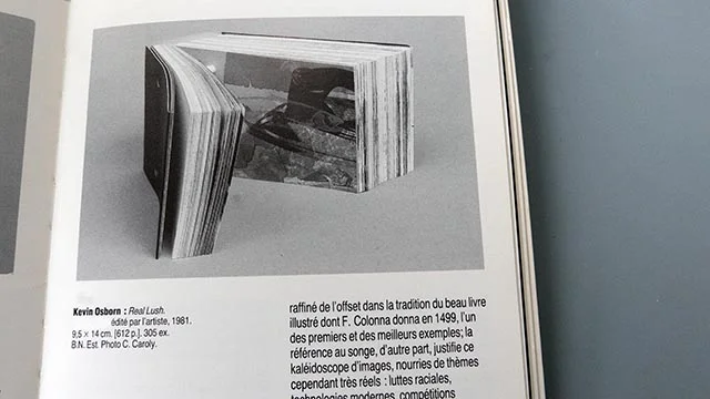
C’est davantage au genre du dessin animé qu’appartient le beau livre de K. Osborn, Real Lush (“Ivresse réele”); sa forme parallélépipédique permet au lecteur de le feuilleter aisément à grance vitesse de façon à faire apparaître, de l’une à l’autre de ses 300 feuilles, des effets de mouvement (course à pied, vol d’une mouette, déplacements d’un poisson ou d’un fer à repasser,…) Des reproductions du Songe de Poliphile de F. Colonna au début et à la fin du volume confirment les deux observations que suggère C. Phillpot dans l’analyse enthousiaste qu’il a consacrée à ce livre (Artforum, 1982): d’une part, K. Osborn se place par son usage raffiné de l’offset dans la tradition du beau livre illustré dont F. Colonna donna en 1499, l’un des premiers et des meilleurs exemples; la référence au songe, d’autre part, justifie ce kalédoscope d’images, nourries de thèmes cependant trés réels: luttes raciales, technologies modernes, compétitions sportives, etc.)
Small Press | 1984
Small Press, September/October 1984
Barbara Braun
“Artist’s Books. The book as artwork in the media age.”
excerpt [P, 64]
To quality as an artists’ book, more aptly called a bookwork, an edition should be multiple (preferably unlimited), inexpensive, and easily accessible. Its visual material should not just embellish a text but fuse with it. Its formal structure—basically, the cover, pages, and sequence of words and images, but also size, shape, paper, binding—and its mechanism—the way we hold, open, leaf, scan, read, and close a book—should reinforce one another. Kevin Osborn’s Real Lush is a successful example. Every component of the book serves to enhance its dense narrative evocation of a young man’s consciousness of the world: its opulent materials (rich red cover, silver endpapers, thickness, lavishly layers visuals, and abundant colors); its compact shape (fitting snugly in the hand, inviting manipulations); the angles binding that abets the flip format. This, in turn, propels the flow of images, a montage of recycled magazine ads, photos, and graphics arranged in set patterns, incorporated with a sparse text and landscapes, and rhythmically overprinted. Depending on the reader, these can be experienced fast or slow, in and out, forward or backward, so that they are static or in motion, visible or hidden. The book is thus the vehicle for the art: appearance, content, and reading/viewing process internally cohere, work together as a unity.
Anderson Gallery | 1984
Anderson Gallery, Virginia Commonwealth University, 1984
Marliyn Zeitlin
“Adding it Up”
excerpt
Each of the works in this show asks the viewer to tally information through narrative, logic, or time. The audience, it can be said, always completes a work of art, either in the Berkeleyan notion of perception or in the code of comprehension of art known as formal analysis. But in these works, the role of the viewer in completing the work is unusually prominent, and that element is part of what the work itself is about.
One important process represented in this show is narrative line. Kevin Osborn takes the concept of a book and seeks the edge of the definition of the medium. The physicality of handling a book, of moving hand and eye in the act of reading, is exaggerated by his playful deviation from the standard format. Osborn’s technical virtuosity, emphasis on process, and conspicuously refined design foils for the semantic ploys of the content: sometimes personal, sometimes learned: always elliptical and ambiguous: the viewer strings together meaning into his or her own strands. …
Afterimage | 1983
Afterimage, Summer 1983
Nancy Soloman
“The Layered Look”
excerpt [P. 48]
Kevin Osborn’s Real Lush opens with a line reproduction of … the dream image of from Hypnertomachia Poliphili. Real Lush is presented in an imposing, almost domineering form. 3-3/4 x 5-1/2in. — its 612 pages make it almost 2 in. thick. The book is held together with two long binding bolts. The pages are skewed into a parallelogram, and the bolts are inserted vertically. The book therefore begins with small pages that gradually increase to nearly full-sized sheets; the tight binding forces the reader to view Real Lush as a flip book.
The reader thus approaches, at a variable speed, a rich and sensual portrayal of the goings on in a contemporary mind. Images parade past again and again. MAKE IT WORK. A large, dark blue clothes iron enters from the right and moves across the mind screen, exiting left into the gutter of the book. A table setting is the same every time. ONLY. Pale pink lovers grow larger and larger, filling the page. A silver gull enters from the lower left and flies off the right edge. Platitudes continue. WORK HARD. FAR AWAY LIFTING OFF. REAL BUSY.
Osborn’s familiarity with offset printing is clearly evident. Real Lush is the idiomatic expression of a person who knows the processes so well that the prints in a painterly manner, using the sort of lush layering one usually sees by chance on makeready sheets. A pale pink portrait of a staring, starving child lies over a pale green convention portrait with a sea of small and similar faces. This in turn is partially covered by large blue iron. The starving child’s pink forehead colors the mountains, and the conventioneers’ faces become a pattern in the tourists’ clothes. A silver fish printed over the scene nearly disappears in the foothills.
Real Lush is a printer’s tour de force. It is also a representation of a human mind simultaneously receiving a multitude of stimuli. Images vary in size and intensity. The large, yet pale child fills the same screen as the mountain scene in postcard perspective and stronger colors. A page later, the nearly invisible fish becomes a bold element—facing right—balancing against a propeller airplane flying left; the plane and the fish are nearly identical in size, suggesting a mind in which insignificant items sometimes loom large in importance.
American Book Review | 1983
American Book Review, May-June 1983, Volume 5, Number 4
Paul Zelevansky
“Visual Literature: Pop Montage”
excerpT
Visual Literature is a literature of mixed means. … The books to be discussed here all work through a condensation of visual and verbal form, utilizing multiple viewpoints, primary documents and consumable artifacts to produce a record of the times.
Kevin Osborn’s Real Lush is a mammoth flip book which spins a high-speed animated tale. The edge of each page functions as a precipice which Osborn uses as both a frame to contain events and a series of boundaries which provide appropriate exits and entrances. Multiple press runs of images and words accumulating and dispersing on each page, are culled from a large cache of media-generated fragments, which together might be considered pop. … The pages read like TV screens carrying several concurrent programs and the black and white and full color sequences create a visual soundtrack. The narrative, which emanates from a lone voice, floats to the surface, leaps out form distant landscapes and becomes entangled in various objects and faces. Whether pages are turned slowly (with some difficulty), or flipped, the book cannot be read strictly from left to right. … Real Lush is montage in the fourth dimension.
Afterimage | 1982
Afterimage, Volume 10 #4, November 1982
Martha Gever
“Parallel ”
Form is everything here. The single hand-sewn signature is folded on the diagonal. Closed, the book is triangular; opened it is diamond shaped. Front and back are interchangeable but not identical. Delicately shaded geometric shapes—lines, squares, and arches—and daubs of color play across the pages. Even the lines of information on the title page are incorporated as patterns. And, printed in almost invisible ink, the word “SEPARATE” repeats across the center spread. This is book-haiku—succinct, elegant, and simple.
Artforum | 1982
Artforum, Volume XX, No. 9, May 1982
ISSN: -0004-3532
Clive Phillpot
“Books, Book Objects, Bookworks, Artists’ Books”
excerpt [pgs. 77–79]
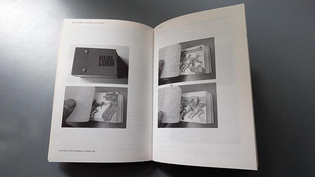
Few bookmakers produce works that are really dependent upon the book form. Many people gather pages together but few conceive their work in terms of the medium. Which is one good reason to welcome: REAL LUSH. ... Real Lush by Kevin Osborn was printed … from March through August 1981. So the book tells us. …
Real Lush is nearly 4 inches high, 5-1/2 inches across and 2 inches thick. The 315 leaves of the book proper have been placed between six silvered endpapers, and a stiffer red cover. The title “Real Lush” is lightly embossed in silvery blue on the spine and on the front cover; it looks like a real lush book. The pages are held together by two bolts, but the leaves of the book were pushed to one side of the vertical before the bolt holes were punched out, with the result that the bolts fix the book so that in cross section it is rhombic rather than oblong. One might surmise from Osborn’s other work that he was simply indulging his penchant for acute and obtuse angles in binding the book this way. In fact it becomes apparent that this binding is actually functional; the pages comprise a very substantial flip book. Since Real Lush is primarily a visual book, and since several of its images progress from left to right, right to left, or spread out, the flip-book format enhances the motion of these images. But the book is no simple quick-giggle flip book.
Before attempting to describe the book and its imagery, it is worth drawing attention to the endpapers, for just inside the front and back covers is the reduced reproduction of a page from a book made nearly 500 years ago. The book is Hypnertomachia Poliphili, or “The Strife of Love in a Dream,” by Francesco Colonna, and it was printed by Aldus in Venice in 1499. The presence of this image suggests several significant lines of thought. In his history of illustrated books Frank Weitenkampf describes Hypnertomachia Poliphili to be “perhaps the finest example of the harmoniously planned book.” It is indeed a fine wedding of type and woodcuts within the space of the page. By referring in his book to Hypnertomachia Poliphili, Kevin Osborn declares his awareness of the tradition of the harmoniously planned book. But Real Lush is unmistakably of our time. It is not some overdiluted remnant of an ancient tradition; it is in every way an artwork of the 1980s in book form and a vigorous example of an artist’s bookwork. C. G. Jung said that the Hypnertomachia “is a picture of the Middle Ages just beginning to turn into modern times by way of the Renaissance—a transition between two eras, and therefore deeply interesting to the world of today, which is still more transitional in character.” Real Lush is similarly an artist’s response to our own period of rapid transition.
The page of Hypnertomachia that is twice reproduced in Real Lush shows the woodcut in which Poliphilus, stretched out under a tree by some water, falls asleep and begins to dream. Presumably, therefore, it is reasonable to assume that Osborn’s book also records a dream.
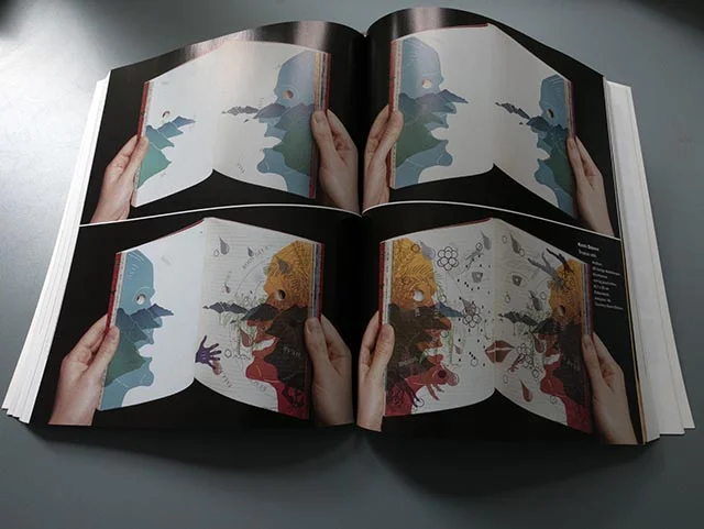
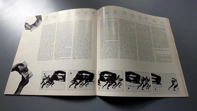
Real Lush is composed of 35 signatures, each of which is made up of nine leaves. The right-hand pages carry the narrative, the left-hand pages bear a sequence of nine related, apparently topographical images repeated throughout the book with minor variations in a central episode. Every signature in the book carries a set of nine images, printed in silvery gray, which give the book a recurring rhythm and over which are printed other images. The first page of every signature bears an outlined human figure simply drawn according to a system of proportion. in the bottom left corner of the first, third, fifth, seventh, and ninth pages of each signature are small drawings of male heads representing different racial types. In the bottom right corner of each page are two small figures, apparently ancient Egyptian and Nubian, wrestling. In each signature they start vertically and finish horizontally. If one flips the pages of Real Lush, the wrestling figures are constantly falling only to rise again, and they thus contribute to the overall rhythm. In addition there is another sequence demonstrating the bandaging and unbandanging of a hand. All of these sequences literally underlie, signature by signature, the images subsequently printed over them, to generate the heartbeat of the book.
The overprinted sequences vary enormously, from landscapes, to runners, to the huge head of an undernourished third-world child, to various animals, to a kiss, to fragmentary texts. In all there are about twenty basic sequences of images, which are sometimes printed in variant forms, mostly in color. Every signature carries the basic image sequence, but over this may be printed as many as twelve other images. Each page normally has two to five layers of imagery, and each image sequence is normally printed in a different color of combination of colors, and can therefore be separately deciphered and charted.
Most image sequences are repeated between five and ten times throughout the book, and appear each time in different combinations of the other sequences. Several of the sequences involve movement; thus runners sprint across pages, a seagull flaps and glides, an iron sweeps across, and in one sequence the military ominously rush in. The threading of these particular sequences through the book gives it a kind of mobile continuity, which is further enhanced when the pages are allowed to flip quickly by. The very last sequence in the book shows the gull gliding serenely up and out of the narrative, leaving behind the various occurrences and commotions.
Describing the contents and mechanics of Real Lush, however, does not begin to explain its dynamic. The essence of the book is the orchestration of the variant image sequences to form the whole, which can in turn be experienced fast or slow, in and out, forwards and backwards. The book starts with the overlaying of just a few images and is therefore initially easy to comprehend and to follow; then, gradually, there are more overprintings, more color, more noise, and more difficulties in deciphering sequences. The tempo of the book is well-judged; after several signatures of densely packed images, there will emerge from a less complicated signature an image sequence that had been barely visible amidst a welter of other images, but that is now revealed. Indeed, the whole book involves a concealment and revelation of its elements.
Hypnertomachia is a romance which narrates the pursuit of Polia by Poliphilus, their union, and eventually the vanishing of Polia when Poliphilus is awoken from his dream by the song of a nightingale. While including the fantastic, the story is also rich in the imagery of Colonna’s time. Osborn employs the imagery of our time, frequently recycled from postcards, photographs, advertising, illustrations, and graphics. With regard to narrative, however, in the case of Real Lush one can make no capsule summary. There are five fragmented texts seeded and repeated throughout Real Lush: these give the most explicit indication of a narrative. They all revolve around the perceptions of a young man. In one text the young man reflects upon his life, and refers to “the odors of dreams”—“lifting off”—“from pages of ink;” also to the fact that “he liked to escape into books where love is struggle and work is mating.” Two further texts involve the man’s mother and father, and one describes a 21-year old woman. Although one of the sequences of images is of a kiss in increasing close-up, this and the reference to the young woman are practically the only suggestions of romance in Real Lush, so any attempt to set up an analogy with the theme of Hypnertomachia will not take us very far. While the verbal clues suggest an odyssey of a young man, they are not definitive: perhaps only the idea of dreaming is common to both books. Certainly flipping the pages gives rise to fleeting dreamlike images which remain in the mind rather than in the eye.
The fact that Real Lush is open to interpretations is one of its attractions; each page or sequence also sparks its own associations. A strong image or a short pithy phrase, is repeated in different contexts as the permutations of printings work themselves out. And each takes on new meanings or associations by virtue of different juxtapositions or superimpositions. The general impression given by the book is of a life lived in our time. There is urgency, there is tranquility. There is the rough and the smooth. There is love, there is violence. “Loose the violence. Lose the beauty.”
Flue | 1982
Flue, Spring 1982
Shelley Rice
“Real Lush”
Real Lush is a beautifully bound and printed flip book. The first page contains a simple line drawing of a female figure; her totemic presence is played off against a tiny picture of two men (one gray and one white) wrestling in the bottom of the page. The struggle of these two tiny men progresses against the backdrop of a sequence of nine offset drawings depicting the evolution of human civilizations within natural landscapes. This short cycle of imagery is continually repeated, but the pictures become more and more complex—line drawings are fleshed out with color and then are superimposed with increasingly dense montages of images and texts—until the end of the book. Violence, sexual roles, machismo, and the impact of technology are among the themes explored in this provocative work, which I recommend highly to anyone interested in the manifold possibilities of artists’ books.
Umbrella | 1978
Umbrella, 1978
ISSN: 0 160-0699
Judith Hoffberg
“Shore”
Shore is an exploration of extending photographic images into the book form through the camera-separation, press-overlay possibilities of offset printing. Printed by Kevin Osborn, the book structure deals with perceptual layering and the experience of that. The entire book from photographic negatives through design and production to binding was done by the artist. The 56 pages are printed in 7 colors, which are mixed from the primaries with the addition of transparent and opaque white ink.
